
Are you being misled by statistics?
- Holly Muir
- Jun 10, 2020
- 11 min read
Updated: Mar 3, 2023
Now more than ever, we’re seeing articles on our favorite news sites accompanied by eye-catching graphics, making it easier to understand the reality behind the numbers. But data can be used to mislead just like it can be used to inform. How can we tell when information that we’re presented with is reliable?
Below you’ll find our guide to many of the manipulations, mistakes, and omissions you’ll often find in data. We think that this guide will help you better separate truths from falsehoods when you see statistics in the media.
This primer is broken into four parts. The first will cover how data is presented and how visual information specifically can manipulate us into forming inaccurate opinions. The second part looks at how data is collected, and the ways in which these biases make it difficult to trust study results. The third part covers the mistakes that are commonly made when interpreting data. The final section includes some questions to ask when confronted with potentially unreliable information.

If you've found this article valuable so far, you may also like our free tool
Part 1: How can visual information mislead?
Trick 1: Truncating an axis
It’s natural to assume that the X and Y axes of a graph start at zero, and so when we scroll past a chart online, we may believe we’re seeing figures compared from the baseline. Truncating the axis of a graph means starting it somewhere above zero, which can make differences or changes look much bigger than they actually are. At first glance, a treatment might appear to be twice as effective as the placebo, or a belief might appear that it has doubled in prevalence, when actually the results are much less interesting. In the example below, a KFC chicken twister looks like it has half the calories of the Wendy’s version (a 360 calorie difference), when there’s only a difference of 70 calories!
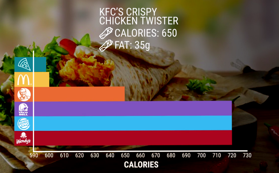
Image source via Venngage
Trick 2: Cherry-picking the time period
If a data visualization selects only a small window of data to represent, then the trend that we see when glancing over it only gives us a small part of the picture. In contrast, if a visualization uses a very large time period of data, then we might struggle to notice any variability or apparently subtle trends in the data. For example, we get a very different impression of Twitter’s market performance if we look at the difference between their performance over three months and their performance over five years:

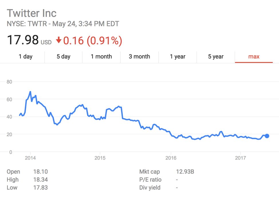
Image source via Venngage
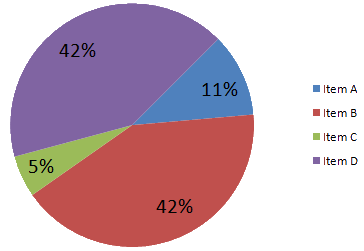
Trick 3: Using misleading representations of information
Sometimes articles include data that is formatted in a misleading way. For example, pie charts should be used to compare parts of a whole, but they should not be used for comparing different groups (and often a bar chart is clearer than a pie chart, even though it may not look as cool). 3D representations of data - as shown in the graphic below - are often misleading, as they make it much more difficult to accurately compare the figures to each other. It’s generally harder to compare the areas or volumes of shapes to each other than it is to compare the height of two bars (hence why bar charts are often preferable).

Similar to the example above, it’s possible to mislead readers by presenting data in unusual, albeit eye-catching shapes. The example below - which illustrates the number of appellate judgeships confirmed during the first congressional term of U.S. presidents - uses gavel handles to represent the number of judges. Both their shape and angle make it difficult for us to interpret this information (note that this graphic also fails to give a baseline of zero, making these differences look more exaggerated than they actually are).

Image source via Venngage
Trick 4: Selecting figures to fit an agenda
It’s possible to represent the same data in many different ways. Politicians, scientists and journalists might choose to emphasize the mean, median, or mode based on whichever best matches the direction they want to sway the reader in. In data that comes from a normal distribution (often referred to as a “bell curve”), the mean, median, and mode will be similar. However, in irregular or asymmetric distributions, these three figures could be vastly different from each other. For example, the mean household income (the income of all households divided by the number of all households) in 2014 according to the U.S. Census Bureau was $72,641, whereas the median household income (the amount which divides income into two equal groups, with half earning above this figure and half earning below) was $53,657! If an author is trying to paint Americans as rich, they can use the first number, whereas if they want Americans to seem less rich, they can quote the second number! In reality, these two numbers simply reflect different information about Americans.
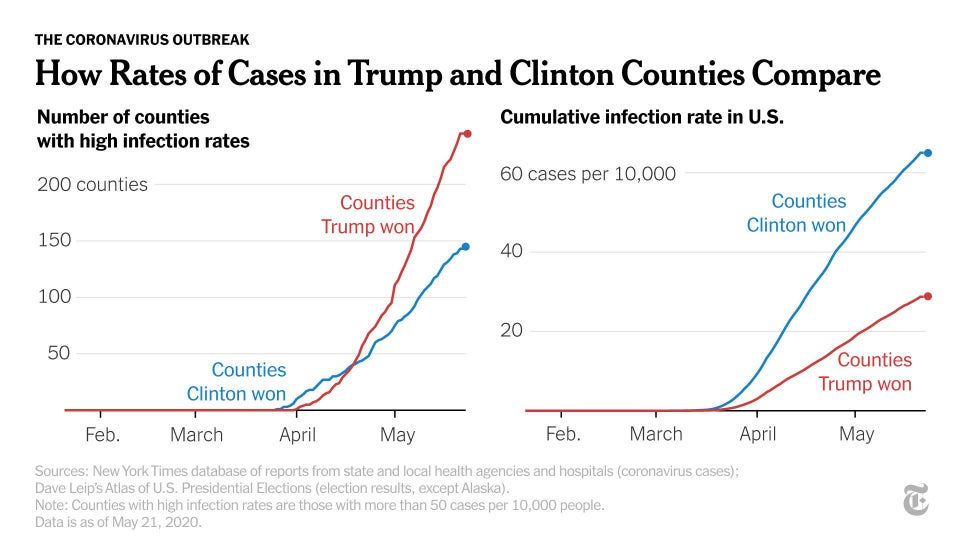
Similarly, it’s possible to express figures in different formats that can be used to demonstrate different conclusions. Check out these graphs below, which show the cumulative infection rate of COVID-19 in the U.S. vs. the number of counties with high infection rates. By picking the chart that better corresponds with a preferred world view, the author can make it seem like their perspective is supported by the data.
Part 2: How can the way that data was collected change the conclusion?
Graphs and other data visualizations can’t provide all the relevant information from a particular dataset or study. Whether or not data is reliable also depends on how the data has been collected. Here’s a list of ways in which data collection can be compromised:
Bias 1: Failing to use a control group when trying to infer causality
When testing the efficacy of an intervention (e.g., a treatment for insomnia), it’s very helpful to record the same outcome (e.g., insomnia levels at 3 months) on a group that doesn’t receive the intervention, otherwise it’s difficult to know whether the effects in the intervention group are a result of the intervention, or are caused by other factors (e.g., maybe insomnia naturally tends to improve over time). The group that is randomly selected NOT to receive the intervention is called the “control group”. If rates of insomnia aren’t significantly lower in the control group in comparison to those randomly selected to get the insomnia treatment, then this undermines the conclusion that the treatment works. Without a control group, it’s much more difficult to make strong claims about a particular intervention causing a desirable effect.
It is important to randomize who is in the control group and who is in the intervention group, as this ensures that (on average) the two populations don’t differ from each other in any other ways than that one group of people ended up receiving the intervention and one didn’t. Failing to randomize who ends up in each of these two groups makes the use of a control group less reliable, as there might be some characteristic that has been accidentally selected for in one or both groups which undermines a comparison between the two.
Bias 2: Wording the question to fit the desired answer
The wording of a survey question can make a big difference as to what the results will be. A good researcher tries to select a wording to most accurately measure the phenomena of interest, but a researcher with bad incentives or a careless approach may choose a wording that biases the outcome. For example, if a researcher was gathering data on how often sexual assault occurs on college campuses, there are a lot of different questions they could ask, and the choice of wording could change the reported rates. A question like “Have you experienced what you would consider criminal sexual assault while on campus?” could lead to different reported rates than a question like “Have you had someone touch your body in a way that you didn't like during the time you've been enrolled in college?” It’s also important to make sure everyone is interpreting the language used in the survey question in the same way. If the researchers who wrote the survey and their typical student respondents are not using the same definition of "sexual assault," then the results of the study could be misleading.
Bias 3: Selection bias
If the participants in the study are not selected randomly (from the population of interest), then the results may not accurately reflect the population at large. Most methods of selection will have some kind of bias: if you’re stopping people randomly on the street, some people may be more willing to answer your survey than others; if you’re calling randomly-selected landline phone numbers, you'll be undersampling younger people that don't own landlines; if you’re surveying people in an urban area, you might be more likely to get responses that lean towards progressive viewpoints. While selection bias can't be fully avoided, the key is to ensure that the biases introduced are small enough that they don't substantially change the conclusions of the study.
Bias 4: Publication Bias
Journals appear to be about three times more likely to publish studies that have significant results and ignore the other (potentially numerous) times that studies produce null results. Some of the research that demonstrates a null outcome can be just as valuable as research that produces a statistically significant result (e.g., if it fails to find an effect that is commonly believed to exist), and failing to publish null results gives us a misleading impression of the field. Data that we see in the media is often reported on because it does demonstrate a significant result, but it’s important to remember that other similar studies may also demonstrate much less noteworthy results (hence why it's very valuable to look at multiple studies done on a topic).
Part 3: What common mistakes are made when interpreting data?
Mistake 1: Ignoring the uncertainty of numbers
It’s easy to forget that numbers in statistical analysis come with uncertainty. When an average is given, it was almost always calculated based on a sample of the population of interest (rather than on the entire population). For instance, if you want to know the average height of Americans, you can’t actually measure every person’s height. You would instead take a random sample of people, calculate their average, and use it to make an inference about the whole population. The larger this sample is, the more accurate the number will be. For small samples (say, 20 people) there is likely to be wide uncertainty in what the true population average really is (which should make us more hesitant about interpreting the results). The amount of uncertainty is expressed by a “confidence interval” (a likely range that the true mean falls into). For example, 95% of the time, the true population average will fall within its calculated 95th percentile confidence interval.
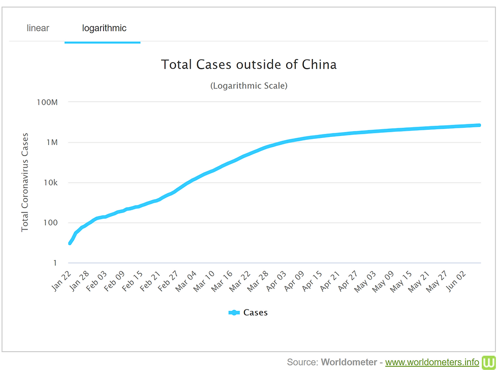
Mistake 2: Mixing up logarithmic and linear scales
It makes sense to show some data sets on a linear scale and others on a logarithmic scale, and it can be very misleading if you don't realize which kind you are looking at. Scales that are linear have the value between two consecutive points remain the same throughout. For logarithmic scales, each fixed unit upward corresponds to an exponential increase (and so a straight line corresponds with exponential growth). See the example graphs below, which show the total of COVID-19 cases outside China on a linear scale and on a logarithmic scale (where each consecutive unit of increase is multiplied by a factor of 100) - they appear to represent quite different trends if we don’t consider their scale! We’ve seen a lot of logarithmic scales used to chart the growth of coronavirus cases, and Vox has created a great video explaining how to understand these charts and what they fail to show us here.

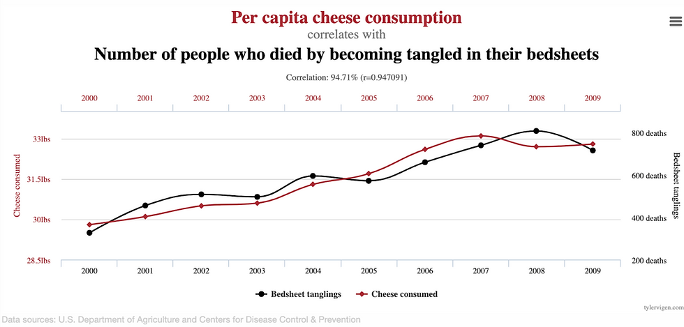
Mistake 3: Assuming correlation implies causation
It’s often the case that two variables are correlated, but this doesn’t prove that one variable causes the other. When X and Y are correlated, any of the following could be true:
X causes Y
Y causes X
X and Y both cause each other in a feedback loop
X and Y are both caused by some other set of factors, Z
the sample size is small, and the apparent correlation was just due to fluke chance
For example, as the chart below shows, it just so happened that per capita cheese consumption is correlated with the number of people who have died becoming tangled in their bedsheets, but we can be pretty confident that neither of these caused the other.
Mistake 4: Overlooking regression to the mean
This is a statistical phenomenon where extreme results tend to “regress” back to the average when follow-up measurements are taken, and this should be considered as a possible cause of an observed change. For example, if you run a study recruiting people who feel very angry right now, it’s likely that the people who were recorded as extremely angry will feel less angry in the following days (thus regressing to the mean). These kinds of results are also very apparent in sports, where someone who performs very well (or very badly) initially, soon returns to a more typical performance as the competition continues. Regression to the mean occurs when we have selection criteria that causes us to focus on data points (e.g., individual study participants) that are especially high or low on some trait (being especially high or low is often caused at least partially by luck). So, more likely than not, the next time we observe these data points, they are closer to their usual mean than they were at the time when we singled them out.
Mistake 5: Using relative change when absolute change is more meaningful
Absolute statistics and relative statistics can paint a very different picture of the world, and it’s important to think about which one is more appropriate in a given circumstance. Absolute change reflects the raw difference between the first measure and the second measure (for example, the prevalence of blood clots in people taking an older contraceptive pill vs. a newer contraceptive pill). This change is written in percentage points, so if the prevalence of blood clots increased from 0.10% when taking the old pill to 0.30% when taking the new pill, then that would be an increase of 0.20 percentage points (0.30 - 0.10 = 0.20). Relative change, on the other hand, reflects the change as a percentage of the first measure. An increase from 0.10% to 0.30% represented in relative change is a 200% increase. A headline that reported the relative change (200% increase!) instead of the absolute change (0.2% increase!) would look far more shocking and scary (and get a lot more clicks). But if something increases the risk of a very rare disease by 200%, that doesn't necessarily make it dangerous enough to be worth worrying about, as it’s still very unlikely to cause you harm.
Part 4: What questions will help you make sense of data?
Below are some questions to ask yourself that will help you spot misleading information.
Does this visual data make sense?
If the data is represented in a graph, is it labeled clearly?
Do the axes begin at 0?
Is it on a linear or logarithmic scale?
If it is a pie chart, do the proportions add up to 100%
Is this format the best way to understand the data?
What information is missing from this data?
If the study reports the efficacy of an intervention, was a control group used? If not, it may be hard to infer causality.
How were the questions in the study worded? Are they worded how you expect they would be, or does the wording inherently bias the result towards a particular conclusion?
How were the study participants selected? If they were not chosen at random, what kind of selection biases might this have introduced?
Is this study small (i.e., it only has a small number of participants or data points, say, 20 per group)? If so, the uncertainty in the outcome may be large.
As you can see, there are many ways in which data can be misleading. That being said, using data (and science more broadly) is still one of the most powerful tools humanity has ever invented for arriving at the truth. It's not that data isn’t useful, it’s that when researchers are biased or careless, they can collect or represent it in misleading ways. Even people who have the best intentions can accidentally omit information and misinterpret results, so looking at data with a healthy amount of skepticism is important when we don’t already strongly trust the source that is presenting it.
Did you find this article interesting? Then we recommend checking out our Skeptical Seekers Test. Alternately, you might be interested in the quiz we made in collaboration with 80,000 Hours, Guess Which Social Science Experiments Replicate!
For some effective examples of visual information, check out this visualization of wealth shown to scale, or Nicky Case’s website, which is full of interactive games that explain how society works. Our guide included some misleading examples and illustrations of data, several of which come from the Reddit thread for misleading visual statistics. Many of the ideas above can also be found in How To Lie With Statistics by Darrell Huff.


